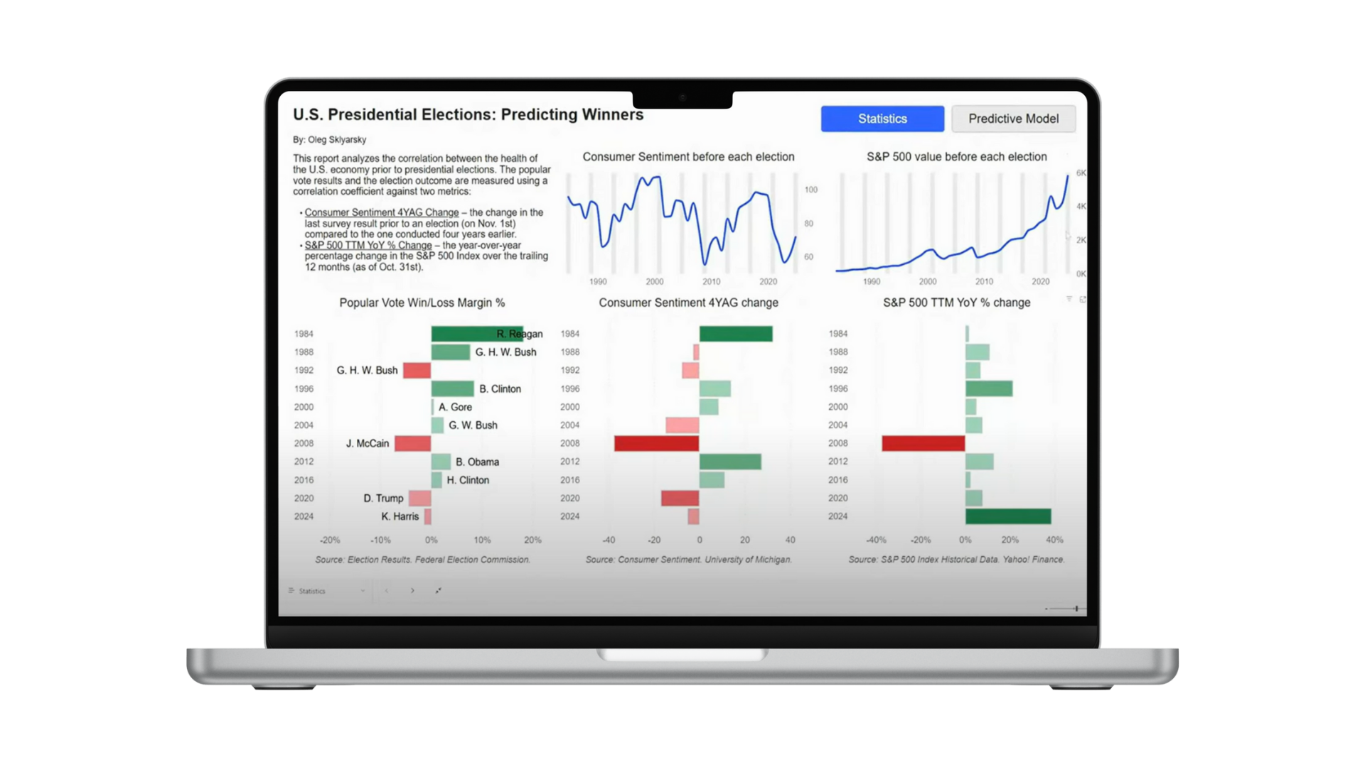
Have you ever taken a moment to think about whether your data visualizations are truly accessible to everyone? In data analytics, designing inclusive reports isn’t just a bonus; it’s essential for clear communication and thoughtful design.
I recently participated in the Power BI Data Viz World Championship, where accessibility made up one-third of the overall score. Accessibility covers many areas, but color use is one of the most important when it comes to data visualization. In this post, I will focus on two key aspects of using color effectively: Color Vision Deficiency (CVD) and Color Contrast.
Read the whole article on Medium.